The Mosaic Design System: Streamlining the design and use of the Rubin Museum of Art
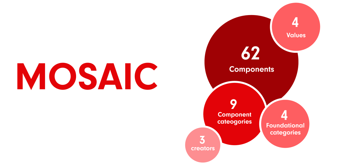
We created the Mosaic Design System as a comprehensive foundation for the Rubin museum website.
The Rubin is a global museum that shares Himalayan art through a dynamic digital platform, participatory experiences, exhibitions, and partnerships.
Over a time span of 6 weeks, we produced a design system consisting of a UI kit and an in-depth documentation of the system to reduce visual inconsistencies in the website.
This case study outlines our process as we created the system, while attempting to preserve the cultural image of the museum.
Client: The Rubin Museum of Art (hypothetical)
Role: UX Designer/Researcher
Team members: Gatha Bhakta, Radhika Mehra, Tharani Prabu
Methods: Component design, User testing, Design analysis, Documentation
Tools: Figma, Google Workspace, zeroheight
Time frame: 6 weeks
Here’s a quick overview of our process
Before we started, we had to zero in on what needed to be improved.
Studying the website >
Identifying inconsistencies
Defining the solution
The first step we took was to look through the website.
Our major goals during this initial walkthrough:
Understanding the major functions of the website: sharing & exhibiting material
Identifying elements that would be most instrumental in achieving the above functions
Observing major issues or inconsistencies in elements noticable at a glance
Studying the website
Identifying inconsistencies >
Next, we listed out all the inconsistencies we observed.
Defining the solution
A close look at the inventory of elements that we put together revealed inconsistencies that could affect user experience while also blurring the museum’s brand value.
Apart from the website experience, designers would also have a really hard time ensuring consistency with the existing website if components were not well defined.
A snapshot of the UI inventory based on the existing website interface
Studying the website
Identifying inconsistencies
Defining the solution >
After analyzing the inconsistencies, we came up with a plan to eliminate them.
The foundation of this plan:
Redefining fonts and colors
Creating base components for all use cases
Defining consistent styles across all components
Next, we started creating the UI kit.
Naming the system >
Laying down principles
Creating components
We decided to first give our system a name, to make it feel more like our own product.
We brainstormed names that we felt were related to the Himalayas and its culture in some way, landing on 4 favorites: Zenith, Mosaic, Mandala and Cosmic. We couldn’t choose one, so we turned to social media!
The poll that was posted on social media
Zenith was a crowd favorite. But Mosaic felt like a better fit, due to the Rubin being a mosaic of sorts made up of art, culture and history, which is what we eventually settled on.
Naming the system
Laying down principles >
Creating components
We laid down some values and principles to guide the creation of our system.
Naming the system
Laying down principles
Creating components >
With the guidelines all set, we got into the actual design of the components.
Inconsistencies were identified and fixed in colors, typography, navigation, buttons, cards, banners and thumbnails.
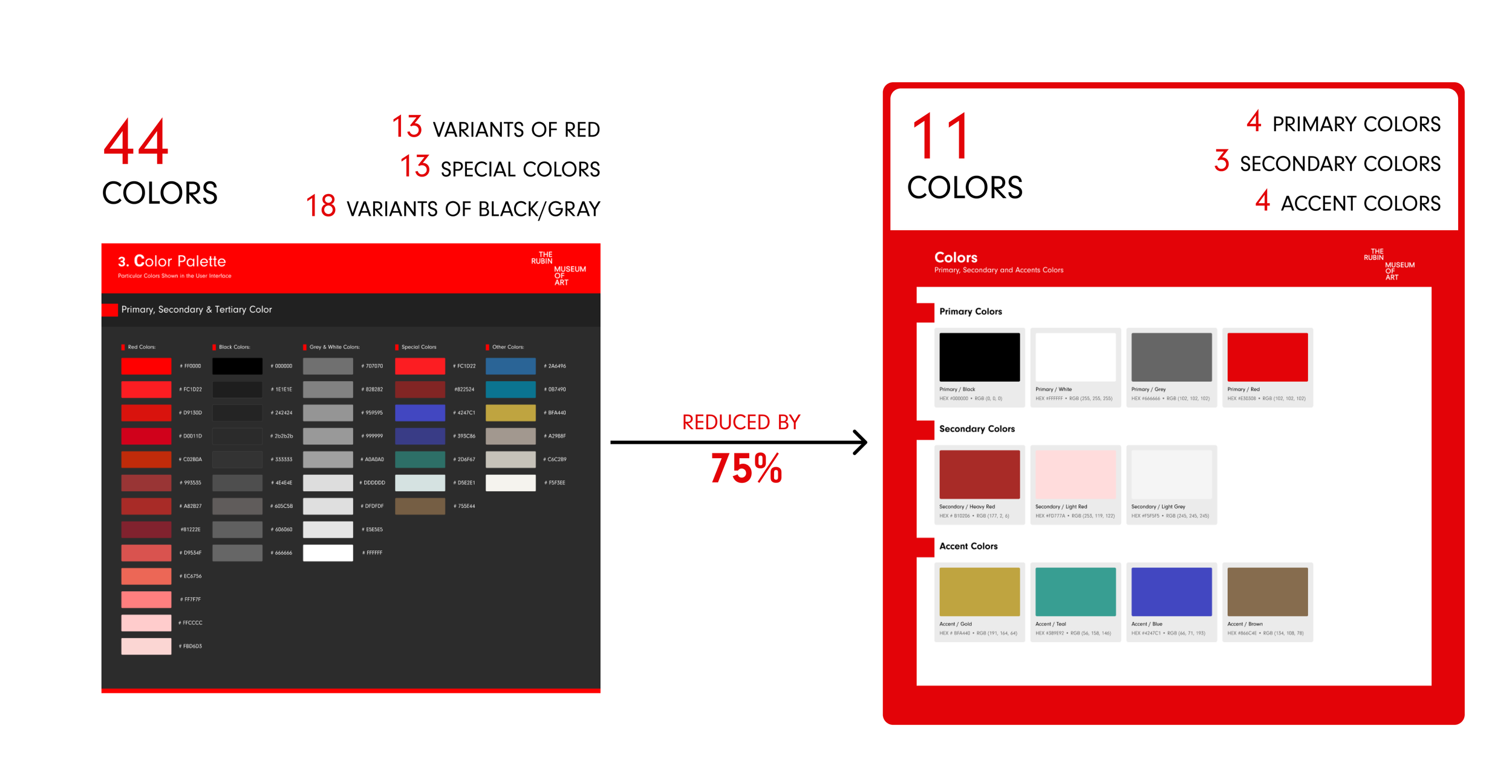
Our first step was to define the colors that we wanted to use, keeping in mind to preserve the museum’s branding. The color palette that we zeroed in on after multiple iterations is below.
Color
The major factor in choosing these colors was visual accessibility. We ran different colors through WebAIM’s contrast checker to ensure that the combinations of colors we were choosing to employ would be accessible to all.
Contrast check of the major colors in the color palette
Next, we chose three different fonts for our typography. Two sans-serif fonts and one serif font were chosen for variety, and also to reflect the museum’s brand and cultural image.
Typography
We condensed all the button styles down to one basic style. Variants of the base component were created for large and small buttons, and for red or white backgrounds.
Buttons
We noticed too many different styles of image usage on the website, in the form of cards, banners and thumbnails, which we worked to reduce for the sake of consistent visual language.
This was also a prime focus since images are a major functioning aspect of this particular website.
Cards, banners and thumbnails
To check how well our solution worked, we tested the UI kit.
Testing goals >
Testing results
Making changes to the system
Once we had built our UI kit, we had the opportunity to test how other designers might use it.
Aspects that were tested
Testing goals
Testing results >
Making changes to the system
We tested the UI kit with three designers, with mostly positive results.
A participant during user testing
Testing goals
Testing results
Making changes to the system >
Based on issues uncovered during testing, we made some changes to the UI kit.
Once we had modified the UI kit, we started documenting our design system.
Writing the documentation >
We chose zeroheight to publish our documentation.
This was the final step to creating an all round design system that can be used the way it was intended to be.
Here’s the structure of our documentation:
Finally, we pitched our design system to our prospective users!
In our pitch, we highlighted the reasons why our system should be used, receiving a largely positive response.
When we say experiences, we mean on both sides of the website. Whether you’re someone who works behind the scenes to bring the website to life, or you’re someone who uses the website to learn more about art, the Mosaic Design System was built for you.
A common base with all the building blocks for designing, making collaboration more inclusive, and easing the incorporation of everyone’s input.
Ready made elements reduce time and effort, and are easy to modify according to adapting requirements.
Skip the initial back-and-forth about basic features like color and fonts, since those decisions have been made.
When designs need to be revised, modify components or use another one altogether - without all the extra hassle.
All components of the system closely adhere to accessibility guidelines, creating a digital product that is accessible for everyone.
The system reduces confusion and enhances experiences for visitors by facilitating consistent visual language across the website.
The design of components show a clear reference to the museum’s mission and values, translating into the final product as well.
Additional guidance on what colors combinations to use is provided, making the creation of accessible experiences easier.
Component designs are unique to the museum’s values and branding, making it easy to imbibe context into designs.
The systems extends collaboration beyond the organization, by inviting suggestions and feedback from the design community at large.
Pitching our system to the rest of the class received an overall positive response and some constructive criticism.
This was my first experience with design systems, and I thoroughly enjoyed the entire process while also learning about how design systems are not just UI kits as I’d believed for so long, they are culture changes in disguise. (taken from a quote Professor MacDonald reiterated many times in his lectures). My team was wonderful to work with as well, and I am very proud of the results we produced together. I look forward to taking this experience forward in my professional career, and being part of the change in design processes in the industry.


