Mind & Me: Designing for effective mental health management
Over half (56%) of the adult population with a mental illness go untreated.
We aimed to find a way to revolutionize mental health management through the creation of a holistic, user-centered digital product.
Role: UX Designer/UX Researcher
Team members: Karan Vora, Priyanka Jain, Tharani Prabu, Yeatasmin Shiropa
Methods: Persona creation, Screening questionnaire, User interviews, Affinity mapping, Journey mapping, Competitive analysis, Moderated user testing, Wireframing, Prototyping
Tools: Figma, Zoom, Google Workspace
Time frame: 16 weeks
Process Overview
final product
We conducted extensive research to understand the problem and identify core requirements.
Surveys and Interviews >
26
Survey Respondents
8
Interviews
Participants who encountered situations where they felt their mental health was not at it’s best
Participants who are currently seeking mental health support
“I want something all-in-one.”
“I want an app that can cater to individual behaviors and preferences.”
“Explain it to me like I’m a 5-year-old.”
Affinity mapping >
Through affinity mapping, we identified some major themes to help guide the design of our solution.
User definitions of mental health
Experiences related to mental health
Challenges faced in mental healthcare
Apps/services used for mental healthcare
Ideal features in an app for mental healthcare
Persona >
From the themes identified through affinity mapping, we created a persona named Sarah to represent the needs and requirements of potential users.
Major needs:
Ways to manage anxiety
Reliable information sources
Major pain points:
Paywalls & subscriptions
Information found online is overwhelming
Difficulty finding suitable and affordable therapists
Journey mapping >
Next, we created a hypothetical journey map to envision what a typical experience for Sarah might look like currently.
Sarah tries to find an app to help with her anxiety, but runs into pain points like inaccurate information, ineffectiveness, paywalls, and struggling to find an affordable therapist, and overall wants something more streamlined where she can incorporate mindful practices.
Problem statement >
How might we provide a streamlined experience for Sarah to improve and keep track of her mental well-being?
Exploring Solutions
Competitive analysis
Competitive analysis >
Through competitive analysis, we identified traits to incorporate into our app’s personality.
Fun colors and imagery
Clear and straightforward
Reassuring and engaging
Understanding
Curated & personalized
Brainstorming >
We brainstormed ideas to figure out what we could implement that could feature the all-in-one aspect, but not be too overwhelming for a user to navigate.
We then narrowed down ideas to form our final solution.
Sketching >
After prioritizing ideas we thought might work, we started visualizing what those ideas could look like in our app through pen and paper sketches.
Some of my sketches of possible features
Defining the solution >
Our solution - a one stop platform for all things mental health, with all features needed to effectively manage mental health in a single spot
This intends to make it easier to discover and access available resources, find the right help catered to each individual and keep track of the help being received.
Therapy
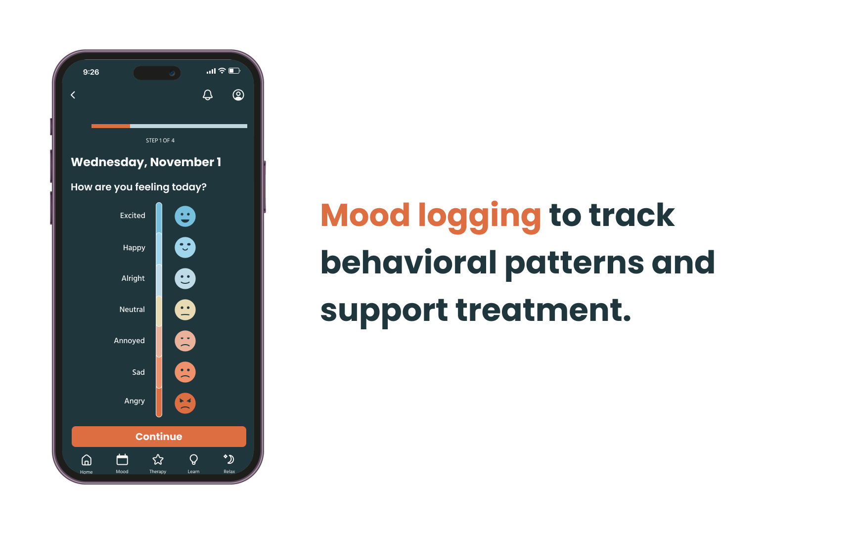
Mood tracking
Sleep tracking
Relaxation
Education
After all the talking and thinking, we actually built the product!
Mid-fidelity wireframes >
We started building the application with mid-fidelity wireframes incorporating ideas from our sketches.
Wireframes from the ‘Therapy’ section of the app
User testing >
We tested the prototype with 5 participants to assess overall usability and identify areas for improvement.
What we tested:
Effectiveness of the nav bar and its contents, as well as the contents of the curated schedule.
The “Therapy”, “Learn”, and “Relax” features of our app.
All features were tested through the “Tracking” feature using the curated schedule process, including the “Mood” feature.
Insights:
Tracking: Users preferred more manual personalization, and for this feature to be represented as a Home page.
Learn: The activity section was not easily discoverable, and mismatch of contents and quiz choices, created confusion.
Therapy: Users felt it was text heavy, and some users experienced confusion with the flow.
Relax: Meaning of some information was confusing, users expected kind of indication of current activity.
Final prototype >
Finally, we created a high-fidelity prototype incorporating all the feedback received from initial user testing.
Frames from the ‘Therapy’ section of the final prototype
Testing the final prototype with users who tested the mid-fidelity prototype yielded much more positive reviews.
“A very smooth flow, I didn’t have to think about things too much this time.”
In response to the overall navigation of the app
“It’s much nicer to look at now that there are fewer buttons here.”
In response to the Therapy section
Future Possibilities
Developing the app further to achieve full working functionality in sync with external resources.
Integrating social features into the app, allowing for people to interact with like-minded individuals and receive peer support.


